Assign Colors to Continuous Variables in Ggplot2
Change Continuous Color Range in ggplot2 Plot in R (Example)
In this R post you'll learn how to adjust the continuous color range in a ggplot2 plot.
Table of contents:
Here's how to do it!
Example Data, Add-On Packages & Basic Graph
Have a look at the following example data:
set . seed ( 568323 ) # Generate continuous example data data <- data. frame (x = rnorm( 500 ), y = rnorm( 500 ) ) head(data) # Print head of example data
set.seed(568323) # Generate continuous example data data <- data.frame(x = rnorm(500), y = rnorm(500)) head(data) # Print head of example data

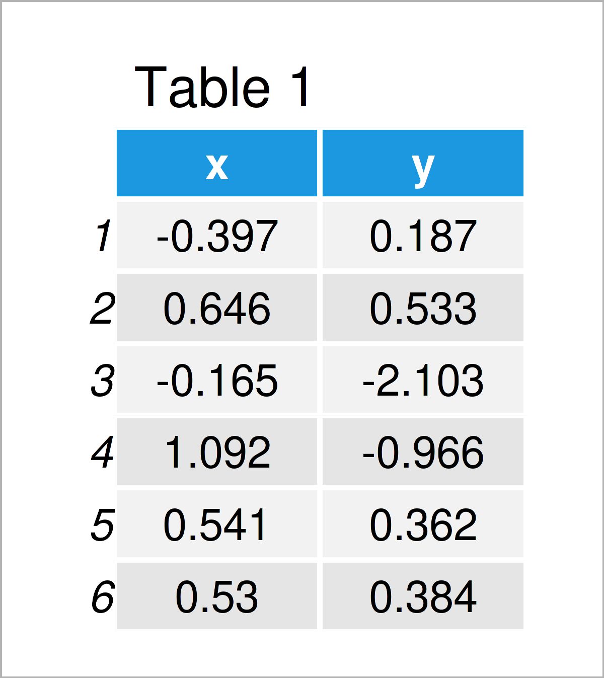
As you can see based on Table 1, our exemplifying data is a data frame containing two columns called "x" and "y".
We also have to install and load the ggplot2 package, in case we want to use the corresponding functions:
install. packages ( "ggplot2" ) # Install ggplot2 package library( "ggplot2" ) # Load ggplot2
install.packages("ggplot2") # Install ggplot2 package library("ggplot2") # Load ggplot2
Now, we can draw a graphic of our data as follows:
ggp <- ggplot(data, aes(x, y, color = y) ) + # ggplot2 plot with default legend geom_point( ) ggp # Draw ggplot2 scatterplot
ggp <- ggplot(data, aes(x, y, color = y)) + # ggplot2 plot with default legend geom_point() ggp # Draw ggplot2 scatterplot

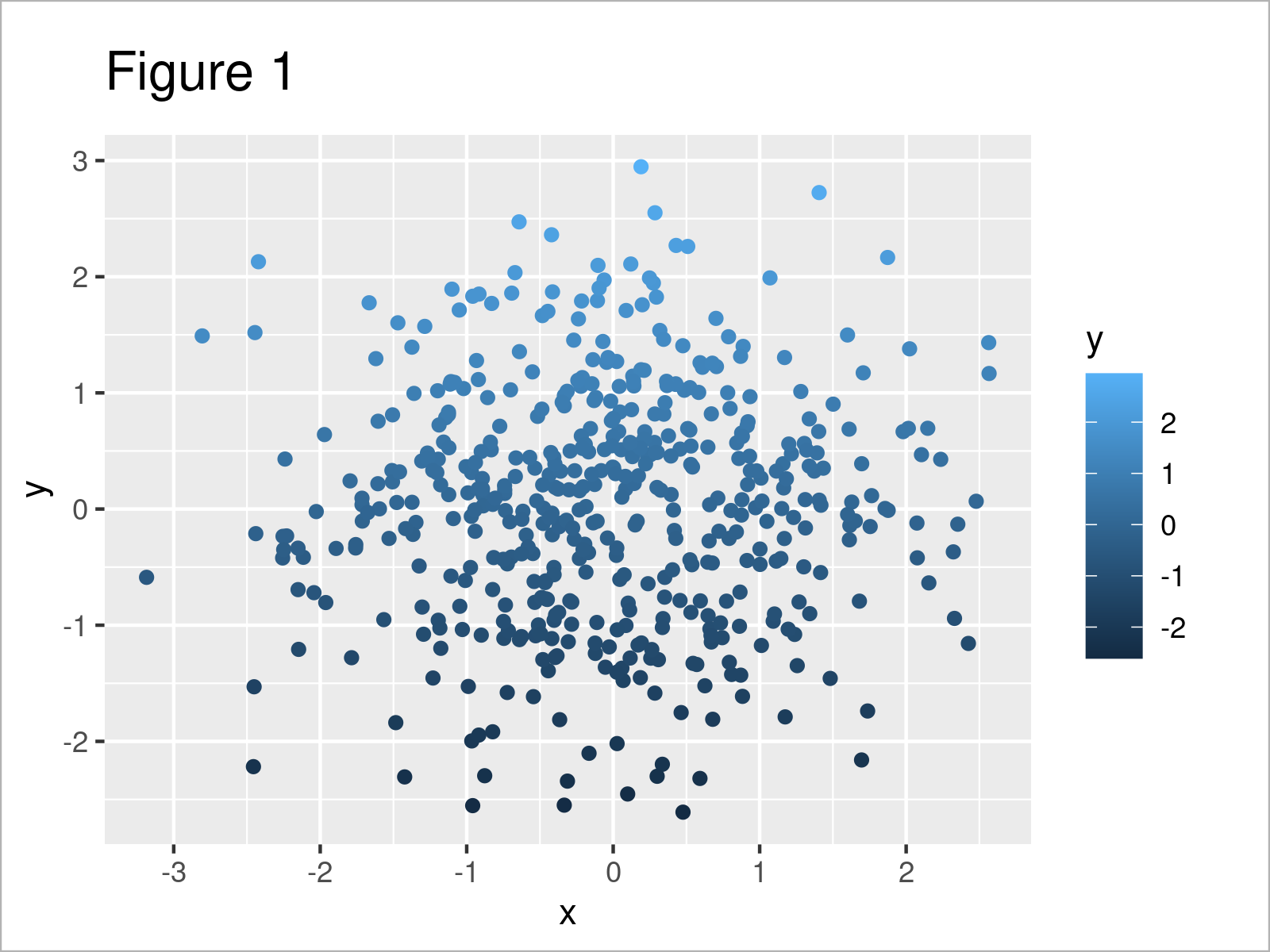
Figure 1 shows the output of the previous code – A ggplot2 scatterplot with default color range.
Example: Set New Continuous Color Range in ggplot2 Plot Using colorRampPalette() & scale_colour_gradientn()
The following R programming syntax explains how to change the color range in a ggplot2 plot of continuous data.
As a first step, we have to define the first and last color (i.e. yellow and red) of our color range using the colorRampPalette function:
fun_color_range <- colorRampPalette(c( "yellow", "red" ) ) # Create color generating function
fun_color_range <- colorRampPalette(c("yellow", "red")) # Create color generating function
The previous R code has defined a new function called fun_color_range, which can be used to generate a sequence of colors.
Let's apply this new function to generate a sequence of 20 colors:
my_colors <- fun_color_range( 20 ) # Generate color range # [1] "#FFFF00" "#FFF100" "#FFE400" "#FFD600" "#FFC900" "#FFBB00" "#FFAE00" # [8] "#FFA100" "#FF9300" "#FF8600" "#FF7800" "#FF6B00" "#FF5D00" "#FF5000" # [15] "#FF4300" "#FF3500" "#FF2800" "#FF1A00" "#FF0D00" "#FF0000" my_colors # Print color range
my_colors <- fun_color_range(20) # Generate color range # [1] "#FFFF00" "#FFF100" "#FFE400" "#FFD600" "#FFC900" "#FFBB00" "#FFAE00" # [8] "#FFA100" "#FF9300" "#FF8600" "#FF7800" "#FF6B00" "#FF5D00" "#FF5000" # [15] "#FF4300" "#FF3500" "#FF2800" "#FF1A00" "#FF0D00" "#FF0000" my_colors # Print color range
As you can see, we have generated 20 hex color codes.
Next, we can use these colors and the scale_colour_gradientn function for our ggplot2 scatterplot. Have a look at the following R code:
ggp + # Change colors in ggplot2 plot scale_colour_gradientn(colors = my_colors)
ggp + # Change colors in ggplot2 plot scale_colour_gradientn(colors = my_colors)

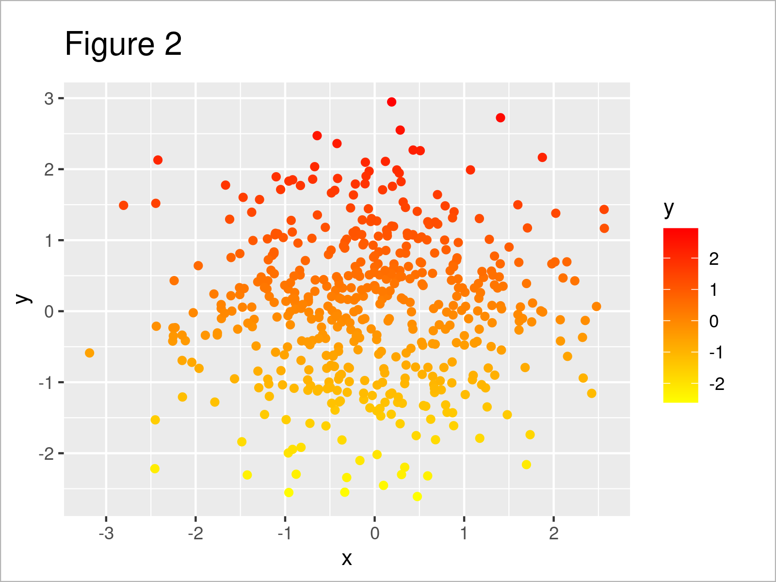
The output of the previous syntax is shown in Figure 2: The values of our scatterplot with a different range of colors.
Video, Further Resources & Summary
I have recently published a video on my YouTube channel, which explains the contents of this article. Please find the video below.
In addition, you may have a look at the other articles on https://www.statisticsglobe.com/. A selection of articles about similar topics such as colors, ggplot2, and graphics in R is shown below.
- Change Color, Shape & Size of One Data Point in Plot (Base R & ggplot2)
- Change Formatting of Numbers of ggplot2 Plot Axis
- Change Background Color of ggplot2 Text Label Annotation in R
- Change Line Width in ggplot2 Plot in R
- Change Display Order of ggplot2 Plot Legend in R
- Change Font Size of ggplot2 Plot in R
- Plotting Data in R
- R Programming Tutorials
You have learned in this tutorial how to change the color range and set a fixed sequence in a ggplot2 plot in the R programming language. Let me know in the comments below, if you have additional comments and/or questions. Furthermore, please subscribe to my email newsletter to receive updates on new tutorials.
Source: https://statisticsglobe.com/change-continuous-color-range-ggplot2-plot-r

0 Response to "Assign Colors to Continuous Variables in Ggplot2"
Post a Comment